Finding The Color Harmony Approaching a painting for the first time
oil on panel, 5×5 inches. View this painting.
This is the final article of a 3 part series discussing the things I notice when I look at a painting.
It’s a bit of art appreciation, but it’s also a way of talking about the things I value most in paintings – solid composition, good light, and beautiful color.
As I said at the beginning of this series, there is no right or wrong way to look at a piece of art.
What I’m sharing here are my observance of what happens when I look at a piece of art for the first time.
There’s nothing formal about this – it happens mostly without me thinking too much about it.
And it happens fairly quickly, too – all in the space of a few seconds.
The first thing I notice is the painting’s center of interest.
Then I take note of the light flowing through it.
After those first two steps, I finally begin to take in the color harmony.
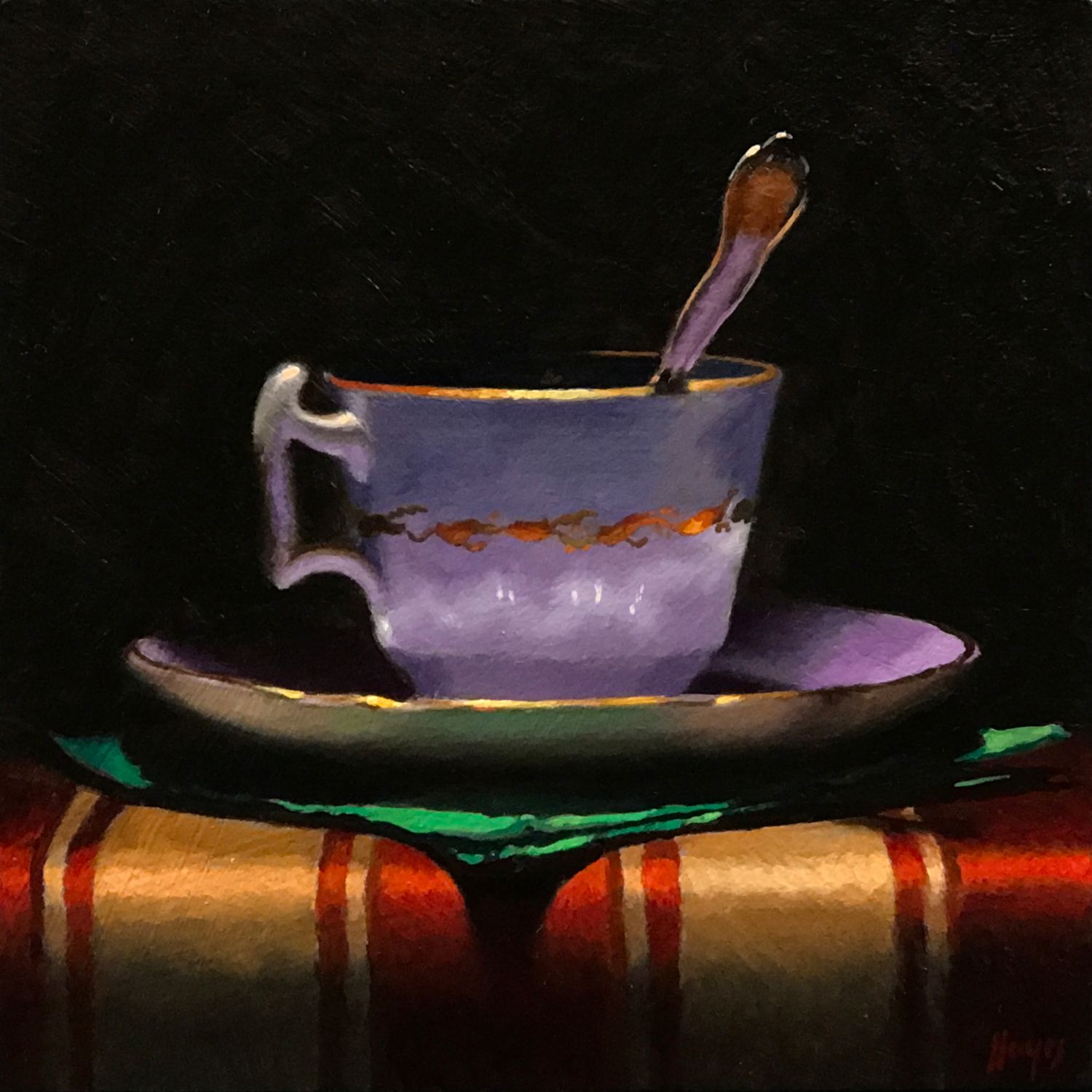
oil on panel, 5×5 inches
Every single painting has its own unique color harmony – much like a fingerprint.
And it is pretty much exactly what it sounds like – the way in which the colors interact and relate – harmonize – with each other
There are many theories about what constitutes and creates good and bad color harmonies.
Theories in general don’t interest me all that much. I prefer experience, so I just begin to notice the color harmony of the painting before me, and follow where it takes me by asking a few questions.
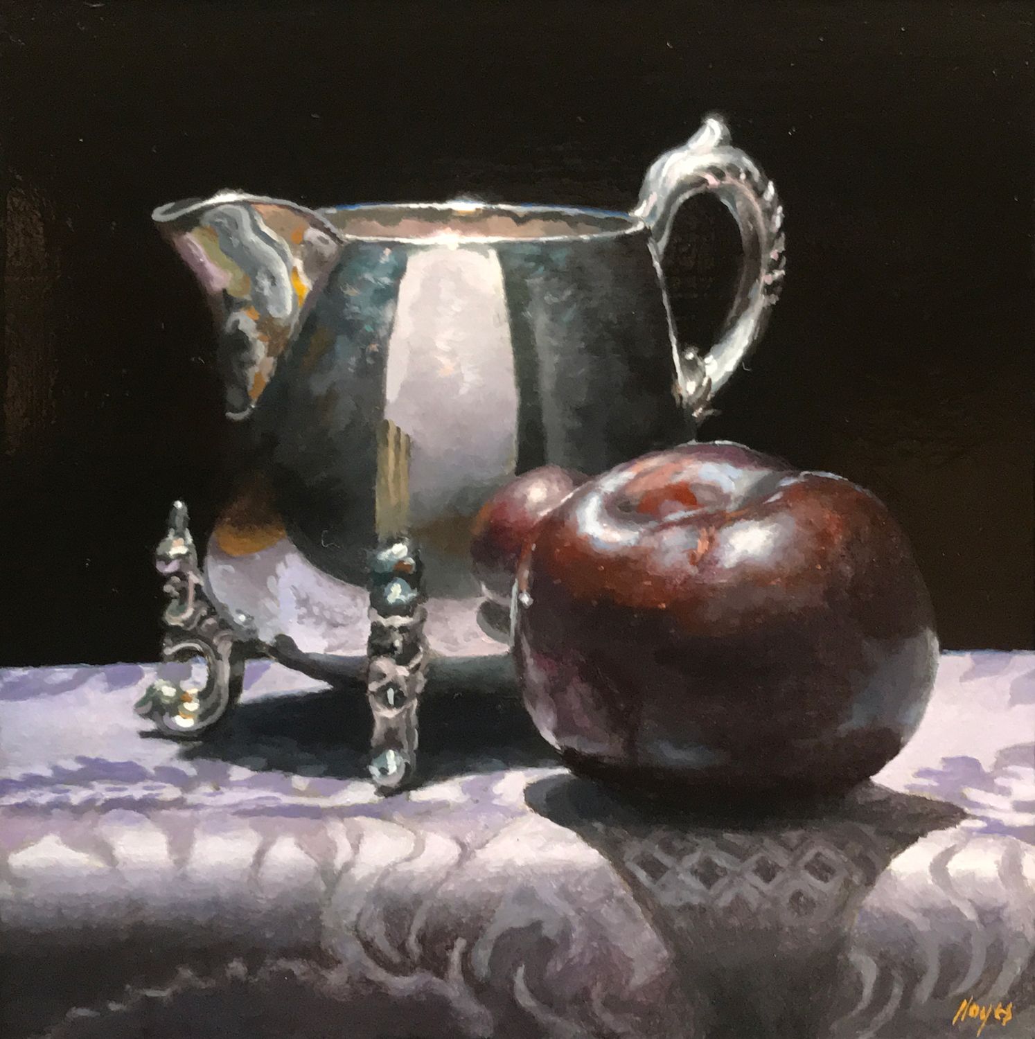
oil on panel, 5×5 inches
First – is there a dominant color? Often times – but not always – this will be the color that is most prominent in the center of interest.
I then try to take in whether there are other important areas of color.
Are there complementary colors? Many paintings are built around color harmonies of complementary colors – colors that are opposite each other on the color wheel. Two complementary colors placed next to each other can create a beautiful vibration that enhances both. Common examples are red and green, blue and orange, and yellow and purple.
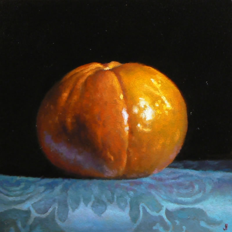
oil on panel, 4×4 inches
Are there different versions of the same color?
This isn’t always present, but it’s an effect I just love to see – by placing different tones of one color – say 3 different greens – in close proximity, the artist can create another kind of beautiful vibration – much like in music.
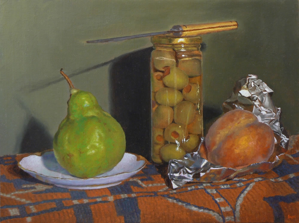
oil on linen on panel, 9×12 inches”
One final thing I look for is the presence of gray – this is far more important to creating beautiful color than one might think at first.
Some of the most beautiful color relationships can happen in fairly gray passages, and often times a colorless area can provide the context to make one strong color really pop.
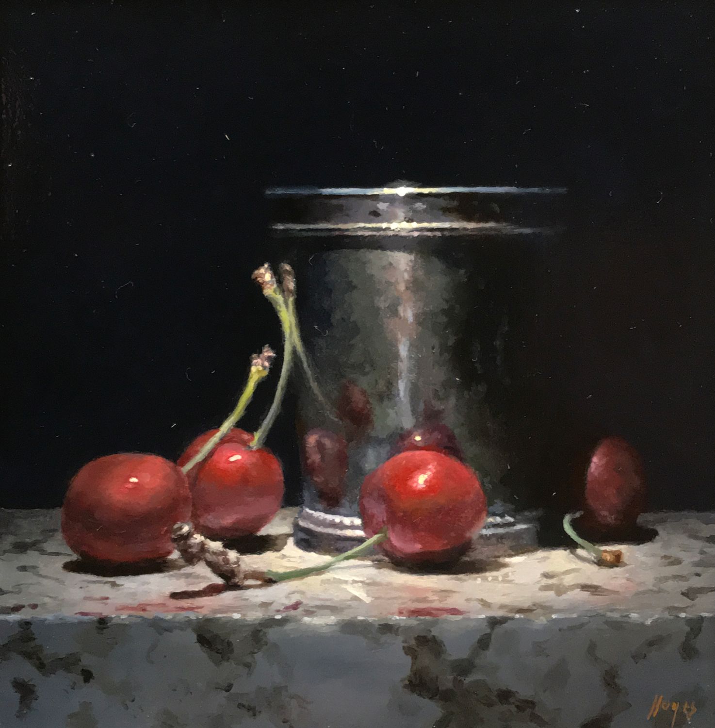
oil on panel, 5×5 inches”
So, by this point – having looked at the center of interest, the light, and the color harmony – I feel I have a good, basic grasp of the painting in front of me.
From that point, I will probably start to work my way in to look at the details. I will also start to think about those three main areas more consciously and deliberately, trying to deepen my initial gut reaction to the painting.
But in the end, that gut reaction that happens in the first few seconds is always right.
