Painters often think in terms of warm and cool colors. It’s one of the tools we have for organizing a picture’s composition, and bringing coherence to the design.
Sometimes it’s a simple as having distinct warm-colored and cool-colored objects in the model – say a cool blue teacup next to a warm red apple.
Often there is a movement of warm and cool colors within objects themselves – that apple might appear warm red right where the light strikes it head-on, but the color may cool considerably as it moves into the shadows, where the light does not directly strike it at all.
Not every picture works this way – with some, it’s an important part of the design, with others, not so much.
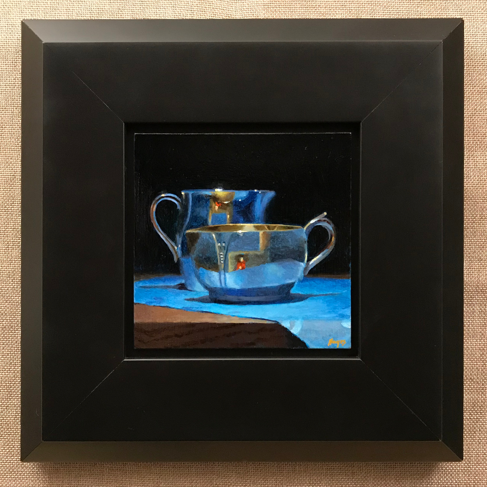
Sometimes it’s deliberate, like with this painting.
Most of the colors are cool, like the background, the silver, and the cloth. In fact, these were painted over a layer of icy blue that can shines through where the paint is thin.
But in the center, there is a burst of warm color, including a small image of myself in a red shirt.
These are all reflections from my studio – warm light from the room pours through the front of the shadowbox where I set up the arrangements that I work from.
I decided to use this to my advantage and make it a central feature of the design. The cool tones provide a wonderful contrast that make the warm areas “pop” in a way they never would if they were surrounded by other warm colors.
PS – I only put the red shirt on when I painted that tiny image of myself. I’m very careful about controlling unwanted light and color flowing into the shadowbox, so I normally wear black when I work. Not just because it’s artsy, but because reflections from brightly colored clothing can subtly alter the color of the light in the box.
Note: This painting was purchased by a subscriber to my list. My subscribers see new paintings a week before I display them anywhere else. To learn more, please visit my subscription page.
