Stages Of A Painting Step by step development of a new work
I recently completed a larger painting (16×12 inches) and recorded the process along the way so you can watch this painting grow.
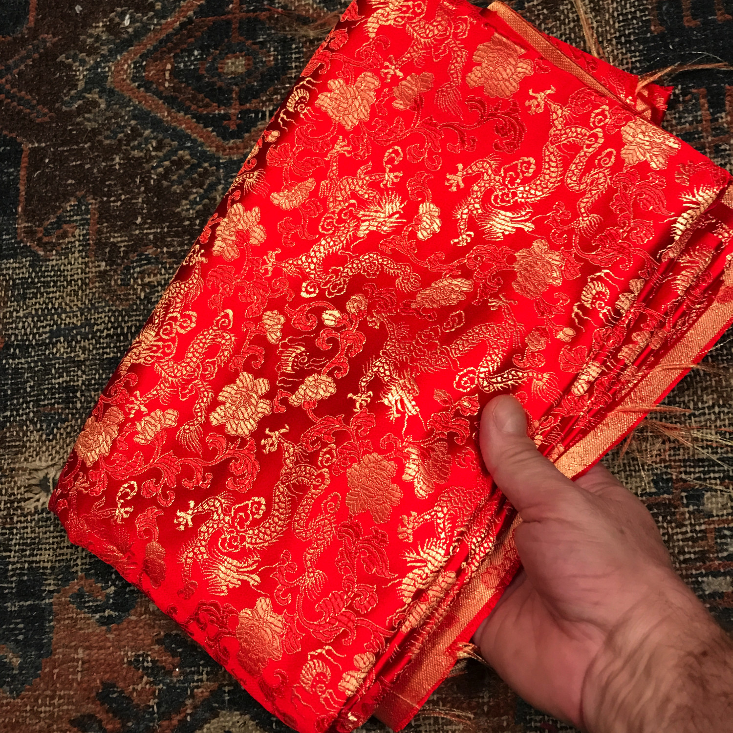
The inspiration for the painting was the above piece of silk brocade in a Chinese dragon and cloud design.
I purchased the cloth more than 20 years ago at a very small and somewhat dingy fabric store in Boston’s Chinatown – I would be amazed if it were still there.
I’ve tried many times since then to work it into a painting, but never succeeded – the red was too saturated and strong to harmonize well with other colors.
So I took that challenge as the starting point for this painting, and decided to make the fabric the central feature of the painting, with everything else subservient to it.
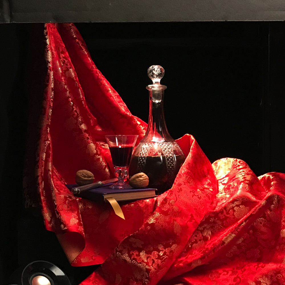
After thinking about a number of designs, I settled on the composition you can see below, as set up in the shadowbox I use.
The cloth flows like lava from the upper left to lower right, while the other elements of the painting form a line sweeping from lower left to upper right, creating something like an X.
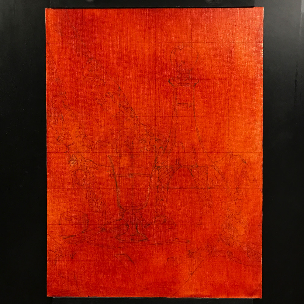
I wanted this painting to be in portrait format, and the final cropping is visible in the drawing on the panel – above.
As you can see, there is a pronounced orange tint to the panel. This results from a thin wash of paint applied to the white linen ground. Doing this cuts the glare of the pure white and creates beautiful effects where the final layer of paint is thin enough to show some of the warm tones beneath. It requires extra care when judging colors, but the final effects seem worth it to me.
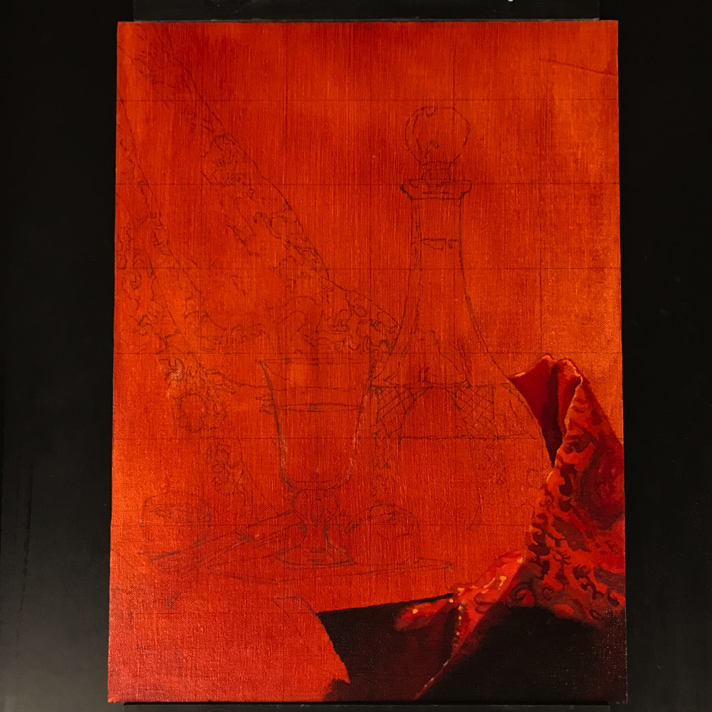
The first application of paint.
I often work in a version of the Flemish technique, which involves a drawing, a black and white underpainting , and a final color layer.
With this painting, though, I am working in the direct method – putting the final color layer directly over the drawing.
Each approach has its strengths and weaknesses.
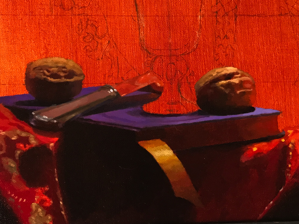
A close-up. I spent the better part of half an hour positioning the bookmark to catch the light the way I wanted it – not too strong, not too weak.
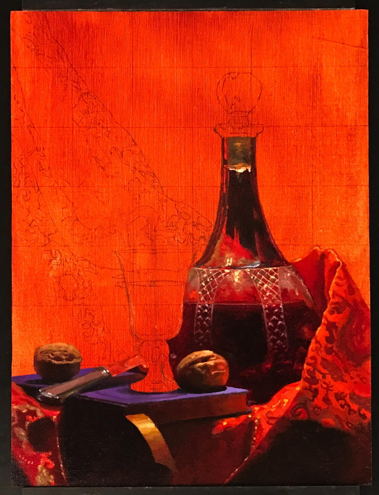
Finishing most of the work on the decanter – I loved the way the facets in the glass made the reflections of the cloth seem like rising flames.
At this point I realized there was a pretty significant error in the drawing – the sides of the decanter’s neck were not symmetrical. The complicated patterns in the cloth to the left probably distracted my eye enough that I just didn’t see it until I began to apply the paint. I decided to wait until the very end to fix it – the dark background would be the last thing I’d paint, and that would make it easier to get the symmetry right.
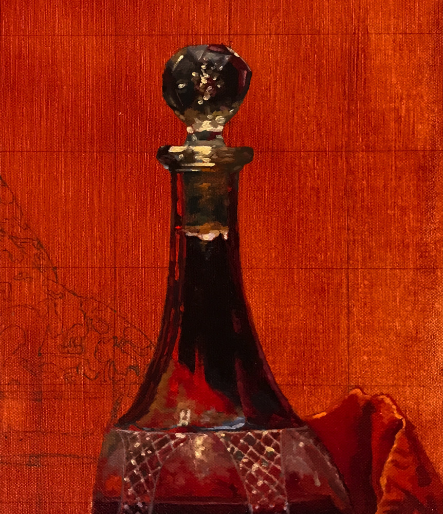
I love the stopper – it has dozens of facets cut into the surface giving it an unusual shape, and is filled with air bubbles that create a dramatic starburst of highlights.
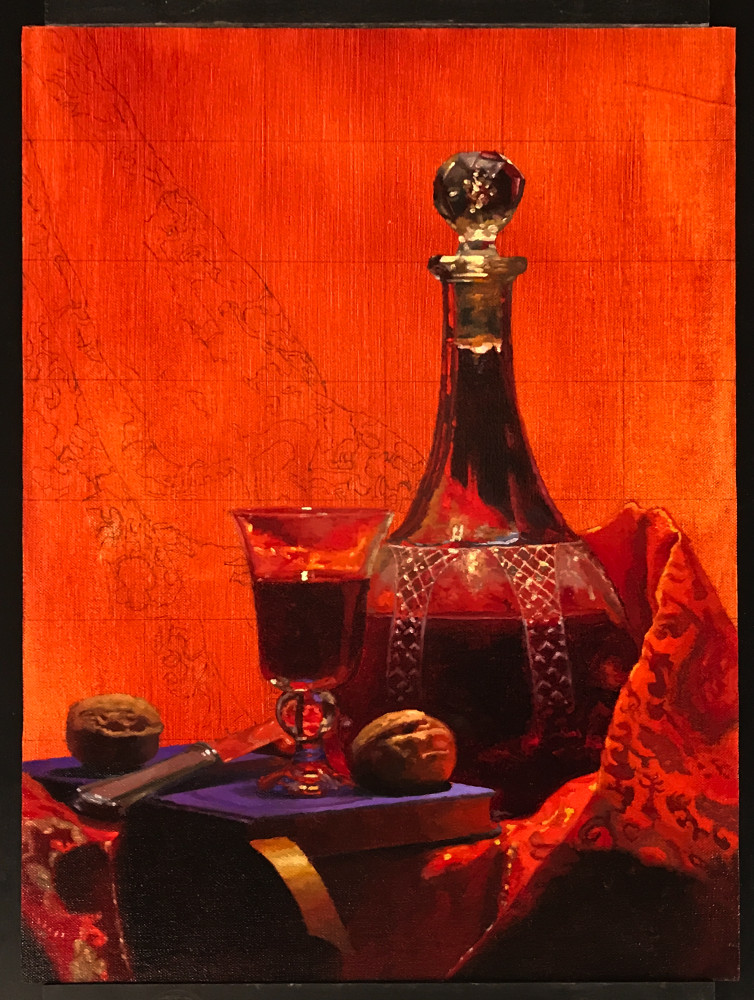
Finishing the wineglass. Again, some symmetry problems that I decided to resolve when painting in the background cloth around the glass.
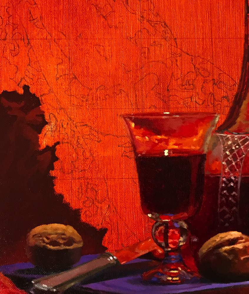
The drawing in some of these sections reminded me of old maps – like the wonderful examples Vermeer painted into many of his backgrounds.
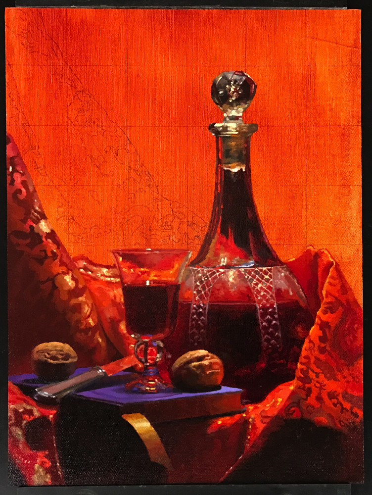
Starting work on the background cloth. The light from above fell just right on the gold threads, creating a cascade of highlights.
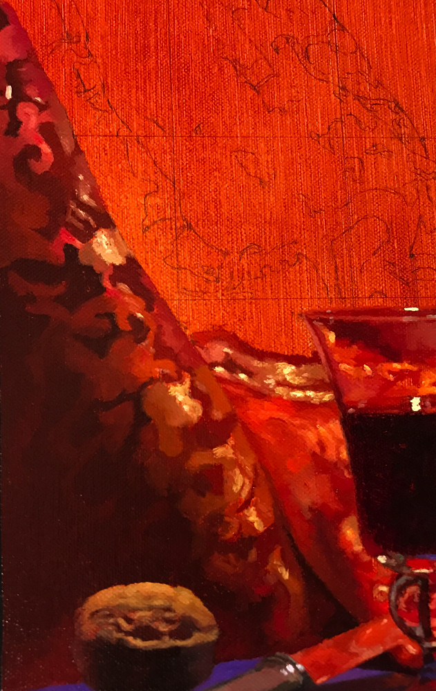
I loved the way the multiple dragon forms in the cloth twisted through the design, in and out of the light.
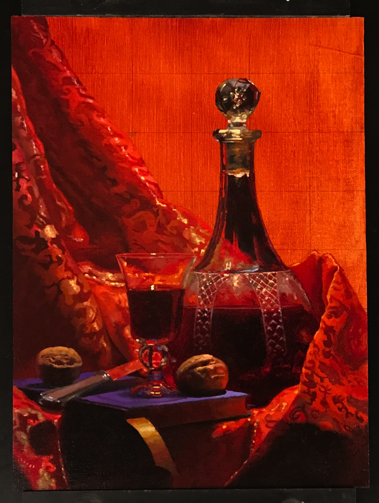
By this point, I could really appreciate one powerful effect of the orange toning of the panel. It was bringing a real unity to all the colors – even the shadows – to the point that the air itself seemed to have a red glow to it.
And in fact this is exactly what would happen – a strong light falling on such a vibrant red would indeed color the surrounding air with a faint reflected red tone.
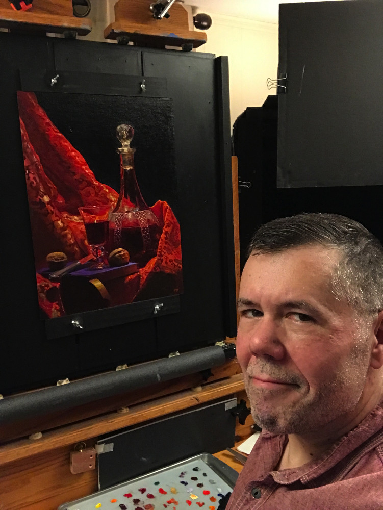
Close to finishing. A few adjustments and corrections – especially the decanter – and the painting will be done.
I will share final images when the painting is fully dry – in about a month.