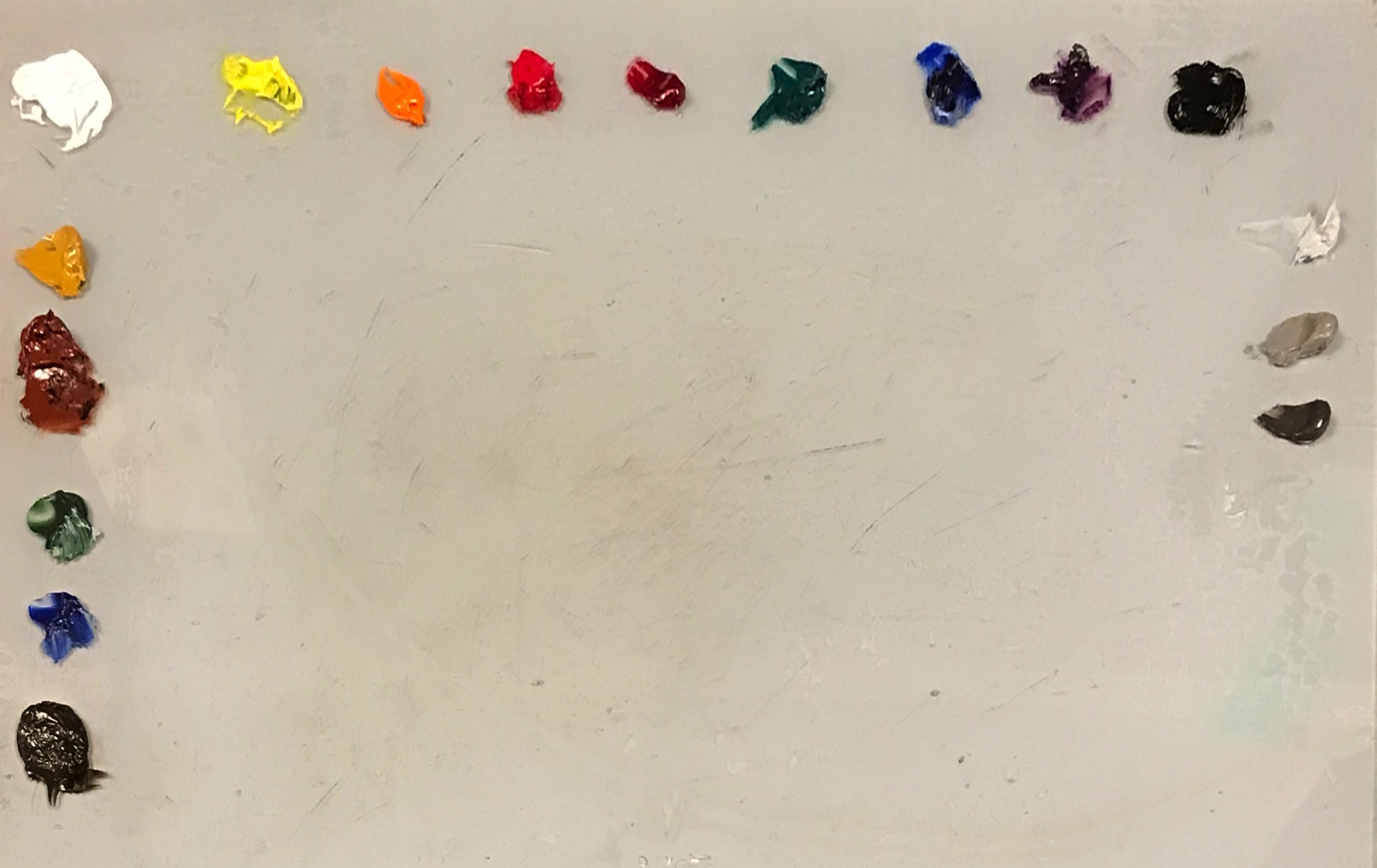
A Still Life Palette The selections of colors I use on a daily basis

Most artists have a specific set of colors that they use most of the time, which we call the palette.
Each develops their own particular palette, based on artistic goals, personal tastes, and the influence of mentors.
Some are extremely small – a palette used by the Swedish artist Anders Zorn (and many others since) contains just 4 colors. Other artists use a vast array of pigments to create their paintings.
But for most, it seems to be between 10 and 20 paints, from which they can mix nearly all of the colors they need.
There isn’t any one palette specifically for still life, but it should be very flexible, and able to produce mixtures in wide ranges – from dark to light, cool to warm, transparent to opaque, saturated to desaturated, and so on – to facilitate the careful study of light and color that still life demands.
My own palette is fairly typical, based on a “split primary” foundation. This simply means that there are warm and cool versions of the 3 primary colors – yellow, red, and blue. White and black are added at either end of the spectrum, and I also add orange, violet, and brown to enrich the possible mixtures. Additionally, a number of earth tones and neutrals are included to help reduce the intensity of the main colors.
I prefer mono-pigments (paints made from just one pigment, as opposed to mixtures of multiple pigments), as they tend to yield cleaner colors when combined with other paints.
My current palette
Looking at the above image, across the top are the strong, saturated colors – the workhorse pigments.
From left to right:
Flake White: The white of the old masters – very subtle and beautiful in mixtures, without the overbearing chalkiness of modern alternatives.
Cadmium Yellow Light: The warm yellow: an intense blast of bright light at the upper end of the spectrum. Often useful in lightening other mixtures.
Cadmium Orange: A clean pigment for mixtures lying between red and yellow – it also makes some beautiful dark reds and browns.
Cadmium Red: The warm red – strong, opaque, and saturated.
Anthraquinone Red: This is the cool red on my palette (as opposed to warm). It is a beautiful deep dark ruby red, and replaces the traditional Alizarin Crimson, which is unstable and fades quickly.
Viridian Green: This can serve two functions – it appears as a cool blue in certain mixtures, and is a clean pigment for mixtures lying between blue and yellow.
Ultramarine Blue: The warm blue on the palette: A deep, noble color that replaces the original pigment made from ground semi-precious Lapis Lazuli stones.
Cobalt Violet: Not a particularly strong pigment, but it creates exquisite shades when mixed with nearly every other color on this palette.
Ivory Black: A cool, subtle pigment that darkens mixtures without overpowering or deadening the resulting tone. Creates some truly beautiful deep shades with the other dark colors on this palette.
Down the left side are a selection of earth tones, mostly for reducing intensity of the strong colors:
Yellow Ochre: The cool yellow on this palette
Venetian Red: Although a powerful pigment, it is still not as saturated as the cadmium red.
Terre Verte (Green Earth): A weak but lovely natural green.
Lapis Lazuli (genuine): Perhaps a surprising choice, as Lapis Lazuli is a semi-precious stone, and the resulting paint ground from it is accordingly expensive. I have had this particular tube for many years and was disappointed when I first bought it – I found it rather dirty and far less beautiful than Ultramarine for a true blue. However, I have found it quite useful as a weak blue for reducing the intensity of mixtures, so I regularly squeeze a tiny bit of out onto the palette and create mixtures with it almost daily.
Raw Umber: A brown earth pigment – creates neutral greys and reduces the intensity of many other mixtures.
Neutrals: Down the right side are a light, medium, and dark versions of a pure neutral tone mixed from white, raw umber, and ivory black. These are helpful in reducing the intensity of mixtures.
From this basic set, I can mix nearly all the colors I need for a painting. When that isn’t possible, I do have an additional 70 or so colors available in the studio. But, to keep consistency and harmony, I try to mix everything using the core palette first.